Step 2 is the hard part.

Matt Ginzton writes here.

Happy New Year

| Comments

Step 1. Teach your almost-2-year-old to say “Happy New Year”.

Step 2. Wake said almost-2-year-old up in the middle of the night because you were going to a New Years party and didn’t have babysitting so you had him sleep in the guest room except he woke up and then saw all the cake and sweets and wanted to eat all the cake and then he had a sugar high and wanted to party.

Step 3. Lie awake in bed at 2 am as said almost-2-year-old says “Happy new year!” over and over and over and over.

Happy New Year, everybody!

Mail.app and Gmail in Mavericks

| Comments

I use email pretty seriously, and like a good thick client. I like what gmail is trying to do, but I’ve never been able to get along with its web interface. My years-old mailstore has many folders, and emulating them with labels works fine but the gmail UI for assigning labels just isn’t as good as what any decent thick client does with folders. So.

I see a lot of hate on the internet for Mail.app), but having tried many alternatives, I really like it1. Or did until Mavericks, which is the point of this post.

The Mavericks version of Mail.app made some big changes to how Mail.app talks to gimap, which I can only assume were to make things work better with gmail’s “labels” system and the idea that unlike with folders, one message can be filed with multiple labels. Because it worked fine before Mavericks, at the cost of perhaps syncing multiple copies of the same message. However, immediately after the Mavericks release, it was well documented that instead of making things better, they’d made them worse.

In fact, it was bad enough that Apple took the unusual step of releasing a Mail.app-Gmail specific update only a few days later.

In my experience, it made things a little better but far from good; even after the update

  • server-side changes (made in another client, or in the gmail web interface, or new mail arriving) may not be noticed for minutes, hours, days, or weeks, or at all
  • if I move messages between folders in Mail.app, the message disappears from the source folder, then reappears a couple seconds later, then disappears again a couple more seconds later
  • the “Mailbox” column in the message list view, which should show what folder a message is in, always shows “All Mail”, regardless of which more interesting folder(s) the message is actually in

The 2nd and 3rd problems are annoying but cosmetic; the 1st problem, though, renders Mail.app entirely unusable. There doesn’t seem to be any workaround — I’ve tried switching folders many times, triggering Synchronize, triggering Rebuild Folder, logging out and logging back in, rebooting, quitting and restarting Mail, even deleting my entire mail cache folder and all accounts and re-adding the accounts and downloading all the mail again. Nothing helped.

Hopefully Apple will fix this soon (there are rumored to be further Mail.app/gmail bugfixes in an upcoming 10.9.1 update). As it is, it means I either can’t upgrade to Mavericks on the machine I actually care about2, or I need to find a different mail client.

So, in the past couple weeks I’ve spent some time dabbling in alternate mail clients. I haven’t found one I like.

Postbox:

  • Works well enough from a strict functionality point of view, but has enough minor problems I still prefer the OS X 10.8 version of Mail.app, and would prefer a version of Mail.app that works into the future.
  • Sluggishness: even after enabling its offline support and telling it to cache all my folders, selecting any message the first time is still sluggish, like it wasn’t cached until I clicked on it. The normal flow is new mail arrives and I can see it in the message list, I click on it, then nothing happens for a second or two.
  • Key bindings: Mac OS accepts Emacs keybindings (things like Ctrl-n for down arrow) systemwide, but not in Postbox.
  • No springloaded autocollapse for dragging and dropping messages to nested folders.
  • Aesthetically: it’s just not as nice as Mail.app.

Airmail:

  • Doesn’t show me all my mail. This is, obviously, a dealbreaker. I clicked around a bunch of different folders, and it only showed me a small recent smattering of messages in folders other than the inbox (for my Sent folder, only stuff for the last 2 weeks; for a lower-traffic folder, it went back about 30 months but only about 20 messages; in all cases it’s far less than the number of messages actually there).
  • Polarizing UI. Some people seem to love it. To me, it just looks weird (dark colors, unfamiliar icon glyphs, unlabelled icons all over the place including parts of windows that don’t normally have buttons, busy menu structure).
  • Weird behavior with nested folders. The toplevel folders are sorted alphabetically (as one would expect); so are first-level nested folders. But folders nested more deeply than that show in an apparently arbitrary order.

For now, I’m sticking with OS X 10.8.


  1. Notably, Mail.app is the only client I’ve ever used that makes IMAP feel perfectly natural, hiding all its design foibles. Other clients want to only download headers until I actually click on a message, or make me configure which folders get cached locally, or expose a difference between “delete” and “expunge”. Mail.app’s default settings just cache the whole IMAP mailstore in the background and make it feel like all the mail is local.

  2. I upgraded some machines I can live without, to see how well Mavericks works. I wasn’t expecting any problems this big. But luckily I didn’t upgrade the laptop I do use every day, which I need for my job; unluckily that machine is the one that would benefit the most from Mavericks banner features: better power management and better multi-monitor support.

Death by Dueling Modal Dialog

| Comments

Setting up a new iPad from a backup of a previous one — which, I think, is the method de rigeur for a few million people in this season — I noticed a really annoying problem.

When you first turn on the new device, runs a fullscreen setup program that is not the normal iOS user experience starting at the home screen (Springboard). It wants to connect to a Wi-Fi network and then it asks you if you want to set it up as a new device or from a backup (and if the latter, whether to restore from iCloud or iTunes). If you elect to restore from an iCloud backup, it chews away for a few minutes restoring your user account, then reboots, and asks you a few further questions in the fullscreen setup program before jumping to the home screen.

As soon as the setup program exits and Springboard runs, normal background services and apps start launching and doing their thing, plus there’s still some first-use setup stuff to take care of, which means that all of the following try to happen simultaneously:

  • email accounts try to sync, realize they don’t have the server credentials, and ask you for a password (for each of several email accounts)
  • iOS wants you to set a device PIN for the unlock screen, and asks you to provide one
  • Facebook account tries to sync, realizes it doesn’t have the server credentials, and asks you for a password
  • if you managed to supply a device PIN without that dialog getting clobbered by one of the other ones, it comes back and wants you to confirm it
  • if you managed to supply your Facebook password, Facebook’s 2-factor authentication says “that’s nice but we just texted you a code which you now need to provide”

All of these happen in modal dialogs that pop to the foreground over the active app… or over one of the other aforementioned modal dialogs. This isn’t supposed to happen with modal dialogs. But it does, here, in the default out-of-box experience for pretty much any iOS device where the owner is upgrading from a previous one that was used for anything serious.

In fact, these password dialogs continue to pop up even when you’re in the middle of typing in an existing one (and if you manage to fill out and confirm one before another one takes its place, it seems like the previous ones may still be there with your previous partial input, or they may start empty when they reappear). The resultant focus stealing issues are worse than anything I’ve seen since the late 90s versions of Windows.

2-factor Authentication Setup for AppleID

| Comments

As part of setting up my new iPad, I got tired of telling Apple I didn’t want to add weak security questions to allow me (or would-be hackers) to reset my password, and decided to set up 2-factor authentication (which is a good idea in any case).

This should be pretty straightforward — and it is, at other sites where I’ve set this up (Google, Facebook, Twitter). Apple’s setup process was a lot more complicated. Judging from the questions and admonishments during this setup process, Apple is a lot more worried than these others about people losing access to the “thing you have” and locking themselves out of their accounts. Which is a legitimate concern, but I think they can make the UI around this process a lot better.

The first place this went awry is the list of devices where they can deliver authentication codes. The AppleID website shows a list of known iOS devices (those enrolled in “Find my iPhone”), and allows you to select any/all of these, plus optionally one or more SMS-enabled phone numbers, to receive login verification codes. The problem is, all of these devices were listed as “offline”, even though at least 3 of them were actually online. I spent some time trying to figure out which parts of the description was clickable (spoiler: none, though there is one part that triggers an inaccurate explanatory popup if you mouse over it and hold still) before I eventually discovered a Refresh button at the very bottom of the list (far enough down I had to scroll to see it).

So beef #1: this page always loads stale information, and doesn’t show you correct information until you click a Refresh button that’s initially offscreen.

After selecting a couple notification methods here (which involves additional careful confirmation to make sure they actually work) and clicking Next, Apple showed me a “recovery key” with instructions to write it down or print it, but not to store it on any computer (and to enforce that, they make it impossible to copy it to the clipboard). OK guys, I get what you’re saying about the whole point being not exposing my keys to hackers, but if I write it on paper I’m going to lose it. Plus the computer I’m on doesn’t have a printer. I’m going to store this on my computer, thanks; I’ll just encrypt it. So I pull out my iPhone and open an encrypted note-taking program and type in this long alphanumeric code and check it carefully to make sure I transcribed it correctly. Then back to the computer and I click Next and it starts to ask me to retype the code, when suddenly… Session Timeout! Back to the very beginning. Time to start over (and this has taken about 10 minutes so far1).

So beef #2: aggressively short2 session timeouts are user-hostile, plus why not give me a chance to confirm I’m still there before just kicking me out of the session, plus the website was willing to let me sit there at the first “recovery key” page indefinitely long, and let me keep doing the work to copy down the useless recovery key3, and only when I click Next does it tell me the session had already expired.

This whole process would work a lot better if the 2 pages in question would dynamically update. AJAX in 2006 was pretty hot stuff. In late 2013, it’s table stakes.
  1. OK, it won’t take me 10 minutes the second time, now that I know what I’m doing, notably with respect to the magic refresh button. But still, there was a lot of clicking done so far and a lot of clicking to repeat, and it’s pretty annoying.

  2. The session timeout wasn’t actually so short that I couldn’t transcribe the recovery key, annoying as it is to type arbitrary hyphenated alphanumeric strings into the iOS keyboard. What actually happened was the AppleID website was slow and the page load between the “configure devices” and “recovery key” page took long enough I went to go do something else for a few minutes, then came back to the “recovery key” page, at which point the session had probably already expired before I even started dealing with transcribing the key.

  3. Useless, because the second time through, the randomly generated recovery key was of course different.

Apple Shopping Cart Fail β€” Gift Card in Cart Makes Gift Card Payment Option Disappear

| Comments

On Black Friday I was trying to buy 2 new iPads to upgrade our 2 old ones.

And I’d been lucky enough to win an iPad 2, which turned into an Apple Store gift card for the value of an iPad 2, as a door prize recently.

And Apple was giving out Apple Store gift cards with most iPads as a Black Friday promotion that day.

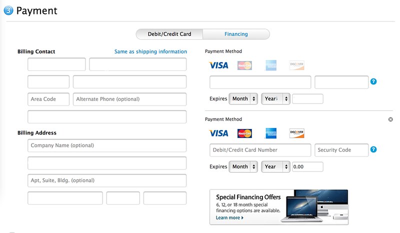
So I added the new desired iPads to the shopping cart, configured them appropriately, clicked along until I got to the payment page, started looking for where to enter the code from my existing gift card… and this started a 15-minute odyssey of reading Apple help pages and becoming convinced the holiday cocktail I was sipping had addled my brain.

I mean, this is not supposed to be hard. But I couldn’t find anywhere to tell it I had this gift card.

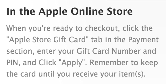
First stop: Apple’s help page describing How to redeem Apple Store gift cards.

Click the "Apple Store Gift Card tab"

That sounds straightforward enough, but that’s funny, I don’t see any such option:

Payment page with no "gift card" tab

I delve farther into other more detailed help pages, to no avail.

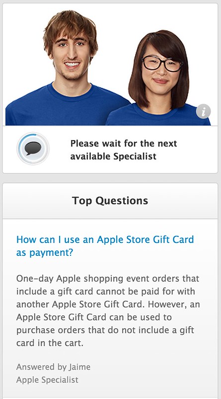
Finally, feeling pretty stupid and blaming the cocktail, I clicked the “Live chat” help button. That popped up this window:

Please wait / Top Questions

And there you have it. Q: “How do I use a Gift Card?” A: “Well, we don’t let you use gift cards on orders containing gift cards, and by the way, all orders today contain gift cards, so have fun trying to use a gift card. This was a sufficiently obvious question to make the #1 FAQ of the day, but we’ll only tell you this after you get frustrated enough to ask for help.”

This was a lot more confusing than it would have been if the “gift card” tab had remained present, which when selected would have been a perfect opportunity to say why this order wasn’t eligible for payment via gift card.

Pro tip for UI designers: making sometimes-applicable-but-not-now options disappear entirely is a lot less friendly than leaving room to explain why they don’t currently apply.

Apple Shopping Cart Fail β€” Multiple Devices on New Cell Plan

| Comments

I was trying to buy new phones for everyone on our family plan β€” we had 2-year-old iPhone 4Ses on Sprint, and were planning on getting new iPhone 5Ses on Verizon.

My first stop was store.apple.com, because Apple’s website (compared to cell carrier websites) is simple1 and easy to use and doesn’t make you want to gouge your eyes out and doesn’t try to upsell you multiple useless accessories during the checkout process.

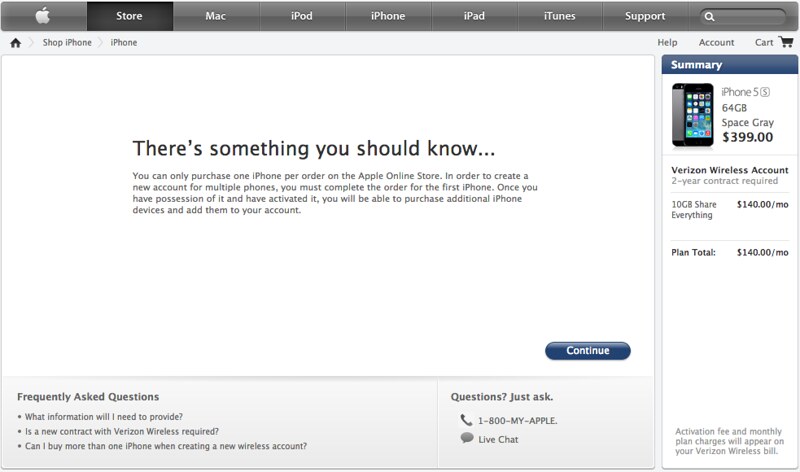
Then I hit this roadblock:

You can only purchase one iPhone per order on the Apple Online Store

This was annoying because at the time (October) there was a 2 to 3 week waiting list for iPhone 5Ses. Presumably this 1-phone-per-order thing isn’t a problem in physical stores, but due to the backlog they weren’t actually stocking the phones in physical stores; you had to pre-order via the website. And the website’s solution was to order one phone, wait for it to arrive and activate it, then there’s enough of an account set up to add more phones to a family plan. But that would involve doubling the wait time, plus initially ordering a different plan than I want to end up on, and switching midmonth, which would probably involve who-knows-what kind of prorating madness. And then the phones wouldn’t all have the same contract date, which would haunt us 2 years from now. No thanks.

I don’t actually know what the reason is for this, that renders Apple unable to sell multiple phones to new customers. It doesn’t really make sense to me; that doesn’t seem like a strange thing to want.

Anyway, the solution was to head off to Verizon’s website, and just hold my tongue and avoid gouging my eyeballs out when confronted with their idea of website design and the multiple clicks per line to skip buying a bunch of accessories I didn’t need. But they were happy to let me sign up as a new customer and ship me 4 phones at once.


  1. This is admittedly less true when buying a carrier-subsidized iPhone than anything else in the entire Apple Store. Everything else, you say you want to buy it and then you pay for it. A subsidized iPhone involves entering all sorts of billing information for your current contract plan or all sorts of loan-application-style information to set up a new contract plan. I can only imagine what kind of backend integration was necessary to get Apple’s store talking to all the cell networks’ billing systems.

Unexpected Side Effects Switching Cell Phone Providers

| Comments

I wanted to note that when switching cell phone providers, one source of trouble I had not expected was the non-portable email address associated with my phone number for email-to-SMS forwarding.

Sprint has an email-to-SMS gateway that forwards messages sent to yournumber@messaging.sprintpcs.com. Verizon does the same thing using yournumber@vtext.com.

I was using this mechanism for a smattering of services that know how to send notifications by email but either don’t know how or charge extra for sending SMSes:

All of these alerts stopped happening when I switched providers, and I only noticed when I realized I wasn’t getting the alerts any more. Then I had to go back and try to remember everywhere I’d used that messaging.sprintpcs.com address (hint: this took a couple iterations).

A different case that ended up working out the same way is Twitter’s SMS integration. Here, they have real support for SMS (not cheaping out and using a per-carrier email forwarding gateway). But it still broke, with the same symptoms, when I switched carriers: over time, I realized I was no longer getting SMS notifications I used to get. I don’t know how Twitter’s SMS integration is implemented, and whether they do it themselves or use some service like Twilio; unlike a lot of sites I’ve seen that ask you for a phone number to SMS, they just ask for a phone number and not which carrier. Anyway, it broke and there was no obvious setting to change to fix it; I ended up deleting my phone number and re-adding it and that fixed things.

State of the Last-mile Internet Connection, Year 2013

| Comments

At home: Using both Comcast and Monkeybrains for their different strengths.

  • Comcast (aka “the man”): I’m using what used to be a 30mbps down/7mbps up DOCSIS 3 connection with an onstensible 250GB/month cap for $74.95/month (ostensibly $62.95/month but with a surcharge for not buying additional services from them). Last year they removed even the threat of overage charges for exceeding the cap (this may change someday but it’s nice for now), and sometime this year they seem to have also stopped shaping my traffic to the 30mbps tier; I now reliably get about 55mbps down and 10mbps up. (DOCSIS cable is a shared medium where you fight your neighbors for bandwidth, but I have never once seen speeds drop below the shaping cap; either Comcast does a good job of provisioning enough capacity or I’m extraordinarily lucky.) I don’t love Comcast’s corporate policies, the fact they’re always trying to upsell me TV services I don’t want, or their “have you tried rebooting it” approach to tech support. But their network works well.
  • Monkeybrains (a San Francisco local neighborhood provider): Their plan for non-businesses is $35/month over 5GHz point-to-multipoint wireless links, using roof-mounted Ubiquiti 5GHz dish antennas. I hadn’t realized equipment like this was generally available, or that you could do reliable long-distance wireless links in unlicensed spectrum. It works pretty well. Non-business customers get a shared medium symmetric link; Monkeybrains tells you to expect somewhere around 20mbps in each direction if you’re lucky but less if the link is poor or congested. In practice, it’s been reliable except during one storm, and I do get about 20mbps in each direction most of the time, though in the evenings when everyone is watching Netflix, I’ve seen it drop to about 3mbps (so here, the shared medium effect is often visible). Also, latency is very good (around 4ms for the last-mile hop); far better than I’ve ever seen from cable or DSL. I chose to get the additional Monkeybrains connection for 3 reasons: first to see if it could completely replace cable, second for redundancy and additional capacity especially upstream, and third to support a local business. Given the speed characteristics, it’s a great value for upstream capacity (over the course of a month, ignoring nightly slowdowns, I could transfer more up through Monkeybrains than even a much more expensive Comcast connection), but it’s often not good enough for streaming video in the evening, so I haven’t chosen to replace cable entirely.
  • Configuring multiple WAN providers is hard. I have my custom Linux router and I’m configuring the firewall, shaping, and routing via shorewall. I find Shorewall a lot easier to deal with than raw tc and iptables, but even after reading all of Shorewall’s Multi-ISP guide and way too much of LARTC, I still haven’t figured out how to configure things very well. In a perfect world, everything would use Multipath TCP or the equivalent, and adding additional WAN providers would immediately give you more speed, even for a single stream. In the real world, Multipath TCP is not widely deployed, and unless you run the equivalent of a VPN tunnel across all your links to a cooperating router elsewhere, single streams use only a single link. Also, you need fairly smart software watching the links and determining their health and reconfiguring routing if you want the ideal reliability case, where traffic flows as long as at least 1 link is healthy. I haven’t tried all that hard, but I haven’t even gotten this working. In practice, what’s easy to set up leaves you with a combined link that’s only as reliable as the weakest link: if any link goes down, at least some traffic stops flowing. I dabbled for a while in round-robining traffic across links (which is kind of like SMP for your CPU: it doesn’t help at all with the max speed of an individual stream, but helps keep multiple streams from interfering, so with a large number of users, it’s a decent approximation of the ideal case), but given the reliability problems and also the naive load balancing that would often result in slower individual streams by choosing the wrong link, I’m now running only Crashplan backup over Monkeybrains, and everything else over Comcast.1

Wireless: I switched our family plan from Sprint to Verizon, despairing that Sprint’s promised “Network Vision network upgrades will ever bear fruit here in the Bay Area. I’ve always like Sprint’s focus on less-confusing, lower-priced plans with an emphasis on unlimited data, but Network Vision has been in progress since 2010, their 3G network has been getting slower in my experience ever since then, and their LTE network is still on the horizon. Now that they’re finally converting Nextel’s lower-frequency spectrum for their own purposes, this could still turn out well, but after waiting 3 years for Network Vision to yield results, I was tired of holding my breath, and I sure wasn’t going to sign another 2 year contract under those conditions. Verizon is also The Man, but it turns out they basically don’t charge any more for a basically equivalent2 4-line family plan for 4 smartphones. So now we’re on Verizon’s LTE network, which ranges from awesome (20mbps down, 7mbps up) in downtown SF to barely passable (data barely trickles in each direction) around our house in the Mission District. Most of the time it works pretty well, though. Latencies on both Verizon’s LTE and 3G networks seem substantially better than Sprint’s 3G network (RTT on Verizon is usually around 70ms; with Sprint it was usually 200ms), which might also be a big factor in it feeling generally snappier for data. True, we had to give up unlimited data, but in practice (partly because it was so slow, partly just due to our natural usage patterns) we weren’t using all that much data on Sprint, and given the observed tradeoff, I actually think $10/GB is a fair price to pay for reliably fast data.

At work: A quick mention that at work, we’ve tried both Comcast and WebPass, another local-ish wireless provider with a focus on commercial installations. I like what WebPass is offering, because they sell symmetric connections and can scale up to quite high speeds. Unfortunately the plans that are cost-competitive with Comcast are quite a bit slower downstream, and reliability has not been all that good. The wireless link layer itself seems fine, but I’ve seen more than a few weird routing problems, and their tech support doesn’t reliably fix these quickly when reported or even call back with promised updates.


  1. I could write a whole post on weird things you didn’t expect to deal with that crop up when you add multiple ISPs to your home network, like trying to keep the weird Xbox Live UDP protocol happy, or updating multiple dyndns addresses, or why it’s not easy to keep Shorewall happy when one link goes down. Maybe another day.

  2. I found it interesting that (in the fall of 2013), Sprint’s mainstream plans all have unlimited data and messaging but still have metered voice minutes; Verizon’s mainstream plans all have unlimited voice and messaging but metered data.

Everything Except the Retina Mini

| Comments

I noticed on Black Friday (the day after Thanksgiving; this year, November 29) that Apple had discounts on seemingly all of their iPad models: iPad 2, iPad Air and iPad Mini. Usually, Apple discounts prices that day (for many products, the only time they’re ever discounted); this year, the discount took the form of a gift card for the Apple Store. Tricksy Apple — we don’t actually get a cheaper price, we just get more for our money.

When I went to order the one I wanted (the new retina-display version of the iPad Mini), I realized they didn’t have discounts on quite all the iPads. The “iPad Mini with Retina Display” is considered a different model and product than the normal “iPad Mini” (fair enough, I suppose) and there was no discount available.

My question: if Apple was discounting all other iPads including the equally-new and presumably hot-selling iPad Air, but not the Retina Mini, what does this indicate about the Retina Mini?

I have 2 theories:

  1. The Retina Mini is in such high demand and/or short supply they have no need to discount it to sell it faster than they can make it.

  2. The Retina Mini is already priced much closer to breakeven, and they can’t sell it significantly cheaper without losing money.

I have no idea which of these (if either) is true. I will note that, having ordered both an iPad Air and an iPad Mini with Retina Display that same day (identically configured, and given the $75 near-rebate on the Air, for nearly the same price), the Mini showed up a full week before the Air. That might put a hole in theory #1. Or it might just mean that the $75-off-an-Air promotion was such a huge hit that it created a huge backlog for the Air.