On Black Friday I was trying to buy 2 new iPads to upgrade our 2 old ones.
And I’d been lucky enough to win an iPad 2, which turned into an Apple Store gift card for the value of an iPad 2, as a door prize recently.
And Apple was giving out Apple Store gift cards with most iPads as a Black Friday promotion that day.
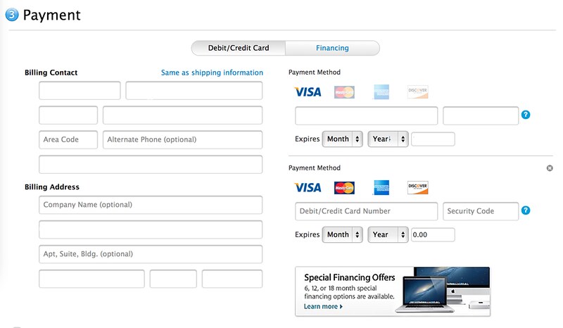
So I added the new desired iPads to the shopping cart, configured them appropriately, clicked along until I got to the payment page, started looking for where to enter the code from my existing gift card… and this started a 15-minute odyssey of reading Apple help pages and becoming convinced the holiday cocktail I was sipping had addled my brain.
I mean, this is not supposed to be hard. But I couldn’t find anywhere to tell it I had this gift card.
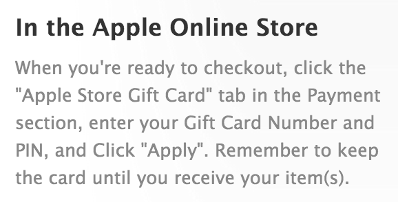
First stop: Apple’s help page describing How to redeem Apple Store gift cards.
That sounds straightforward enough, but that’s funny, I don’t see any such option:
I delve farther into other more detailed help pages, to no avail.
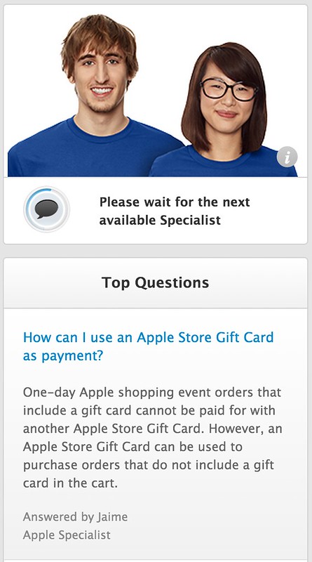
Finally, feeling pretty stupid and blaming the cocktail, I clicked the “Live chat” help button. That popped up this window:
And there you have it. Q: “How do I use a Gift Card?” A: “Well, we don’t let you use gift cards on orders containing gift cards, and by the way, all orders today contain gift cards, so have fun trying to use a gift card. This was a sufficiently obvious question to make the #1 FAQ of the day, but we’ll only tell you this after you get frustrated enough to ask for help.”
This was a lot more confusing than it would have been if the “gift card” tab had remained present, which when selected would have been a perfect opportunity to say why this order wasn’t eligible for payment via gift card.
Pro tip for UI designers: making sometimes-applicable-but-not-now options disappear entirely is a lot less friendly than leaving room to explain why they don’t currently apply.


